Animated infographics: How to bring your content to life
Animated infographics are having a moment. Whether they’re GIFs or videos, they’ve become some of the most shared content on social media. So what makes them so compelling to consume? Let’s take a close look at some great examples that can inspire your next animated infographic design.
What is an animated infographic?
—
An animated infographic is a way of visualizing information using a combination of imagery, illustrations, charts, graphs, text and other elements that are animated to add movement.
Over the last five years, infographics have become heavily relied upon as a device to make complex information palatable. But what was once a mostly static form of content has evolved dramatically to include animation and animated elements that help make ideas more easily interpretable and engaging.

The beauty of infographics has always been their shareability. Whether they’re GIFs or videos, animated infographics are visual pieces of content that are easy to consume and easily linked to.
Kick-start your static infographics
—
When infographics first gained serious traction online, they started as static illustrations. They would often take the form of extremely long images you’d need to scroll through, but they had a certain charm to them. Shapes, colors, illustrations, and an easy-to-follow structure are big reasons why static infographics work. All that scrolling was exactly what made the experience enjoyable. It was all about the journey.
Today on social media, still images don’t do as well as animated ones. So, if you’ve already invested static infographics for your brand, you may want to consider adding animation to them and give them a new life.
We recently created a static infographic to celebrate Bauhaus design. But we wanted more than just a static image to really bring the topic to life and get the most out of our content. So we decided to also turn it into an animated video infographic. Here’s how it turned out:
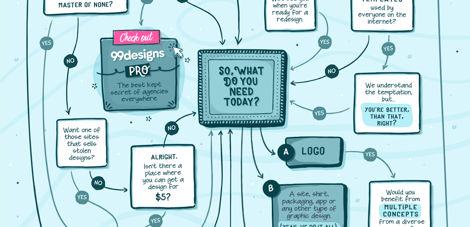
If you want something more subtle, another option that will give your static infographics a little boost is integrating mico-animations. These small, subtle animations can highlight information or point to clickable areas in your infographic. Here’s an example for a clickable flowchart with mico-animations in GIF format we recently created:
This is something you can do with any static infographic. Check out these three examples of the most common styles of static infographics today and some more suggestions on ways you could bring them to the next level using animation:
Animated elements catch the eye
This static infographic on “How to leave your worries behind” by Happify provides advice on how to feel happier and worry less. It offers a delightful combination of clean design, bold colors, a clear font hierarchy and evocative illustrations. It’s not overly long and is broken up well.

While they’ve done a good job in picking distinctive icons and illustrations that feel familiar—like a fading battery icon to represent a character’s shrinking happiness—this infographic could benefit from adding animation.
In the header, making the woman actually jump up and down would definitely catch the eye. The pie graphs that work as a border around some icons could animate-in using a circular wipe to emphasize the percentages they represent. And in the “How to Worry Less” section, the checkmarks and crosses could animate-in using a bounced zoom effect.
Animations highlight what matters
Bold and well-targeted, this static infographic on “Women who run the world” by USC Marshall presents the growing, diverse pool of female entrepreneurs, how they comprise the market and which companies they run.

USC Marshall has used business iconography effectively in this infographic, utilizing icons of buildings and banks as elements of a graph to highlight percentages the infographic calls out.
However, these icons could be made much clearer by animating-in one-by-one to emphasize that they’re a visual representation of a percentage rather than random icons in a line.
Like the previous infographic, the pie graphs that border some images within should animate-in with a circular wipe.
Animation clarifies information
Cheeky right from the beginning, everything about this static infographic on “How to avoid a hangover” by Fix perfectly matches the tongue-in-cheek nature of this topic and the way people will be feeling as they read it.
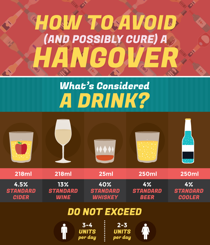
Exploring a topic I’m sure we’ve all experienced at some point or other, this deep-dive into how hangovers are created and cured smartly utilizes illustrations of real-world objects like bottles and glasses of cider, beer and spirits.
The “How a Hangover Affects the Body” section, which points to different organs, could benefit from animation to make the information clearer. Each symptom and solution could animate from the direction of the organ they’re related to, clarifying which body part is affected. And, where different hangover cures from around the world are highlighted, simple, animated waving flags would add to the character of the piece and draw attention to the main point of that section.
GIF animated infographics
—
Following the popularity of the static infographic was the rise of the animated GIF. The strength of using animation into an infographic is that it helps emphasize certain facts and figures, making your infographic even more digestible.
The best thing about GIFs is that they’re not all that hard to make. You don’t need to know your way around complex programs like Adobe Premiere Pro or After Effects. You can actually create them in photo-editing programs like Photoshop.
Here are some of the best examples of animated GIF infographics:
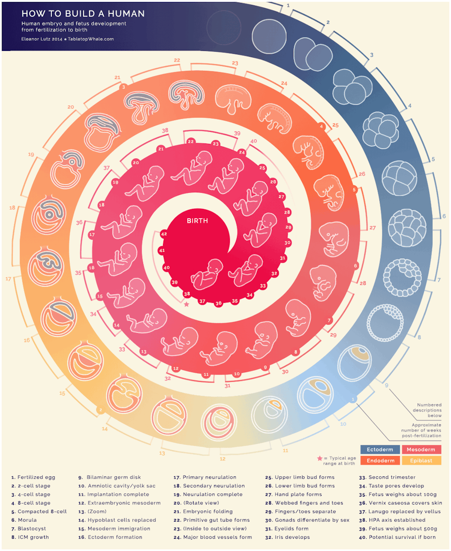
Example 1: How to Build a Human | Tabletop Whale
Using the static structure of a swirl, with markers for the months of pregnancy, this infographic shows a loop of an embryo, gradually morphing into different forms as it heads into the middle section, “birth” as a fully formed baby.
This is a fantastic example of the power of animation in an infographic. A simple concept that’s executed really well, requiring very little text to interpret what’s going on.
Example 2: 7 Ways to Hack a Drought | Column Five
This animated graphic about how to hack a drought shows how an animated illustration can complement the information it’s supporting.
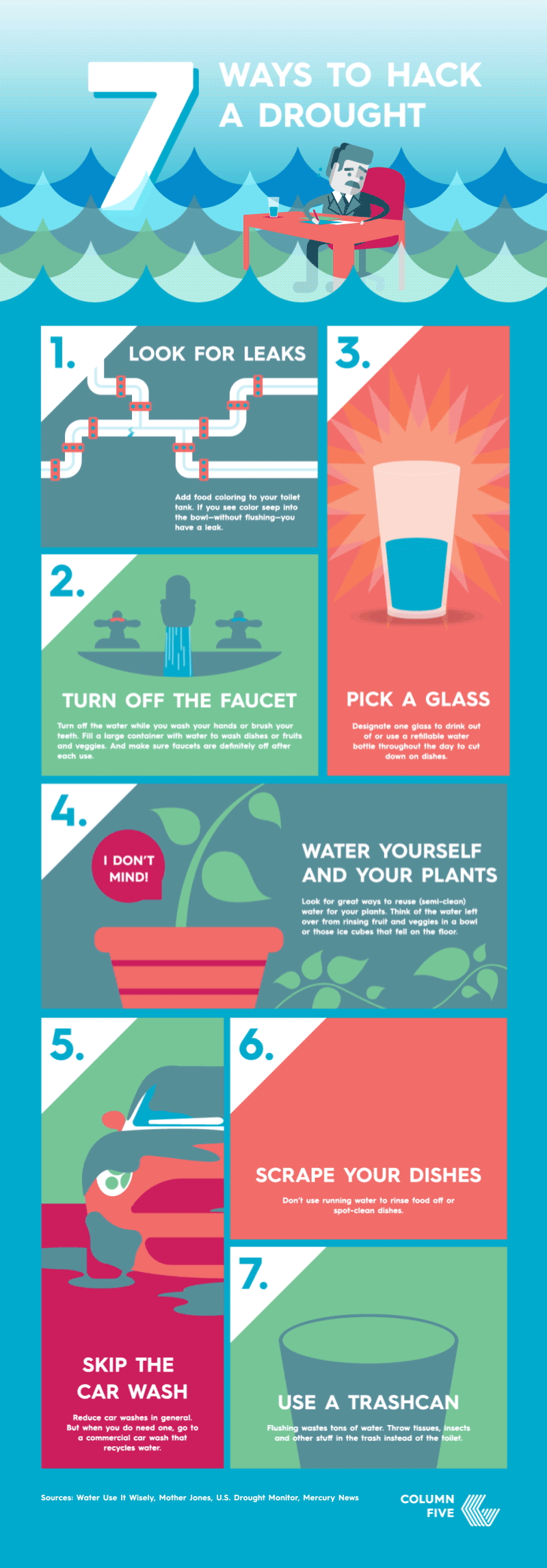
The moving waves of water at the top near the title quickly communicate what the infographic is about. The text hierarchy is clear, from the large numbers to the top-level section titles to the detailed text. Each animated illustration has been selected carefully in order to emphasize what to take away from each tip, rather than distract from it.
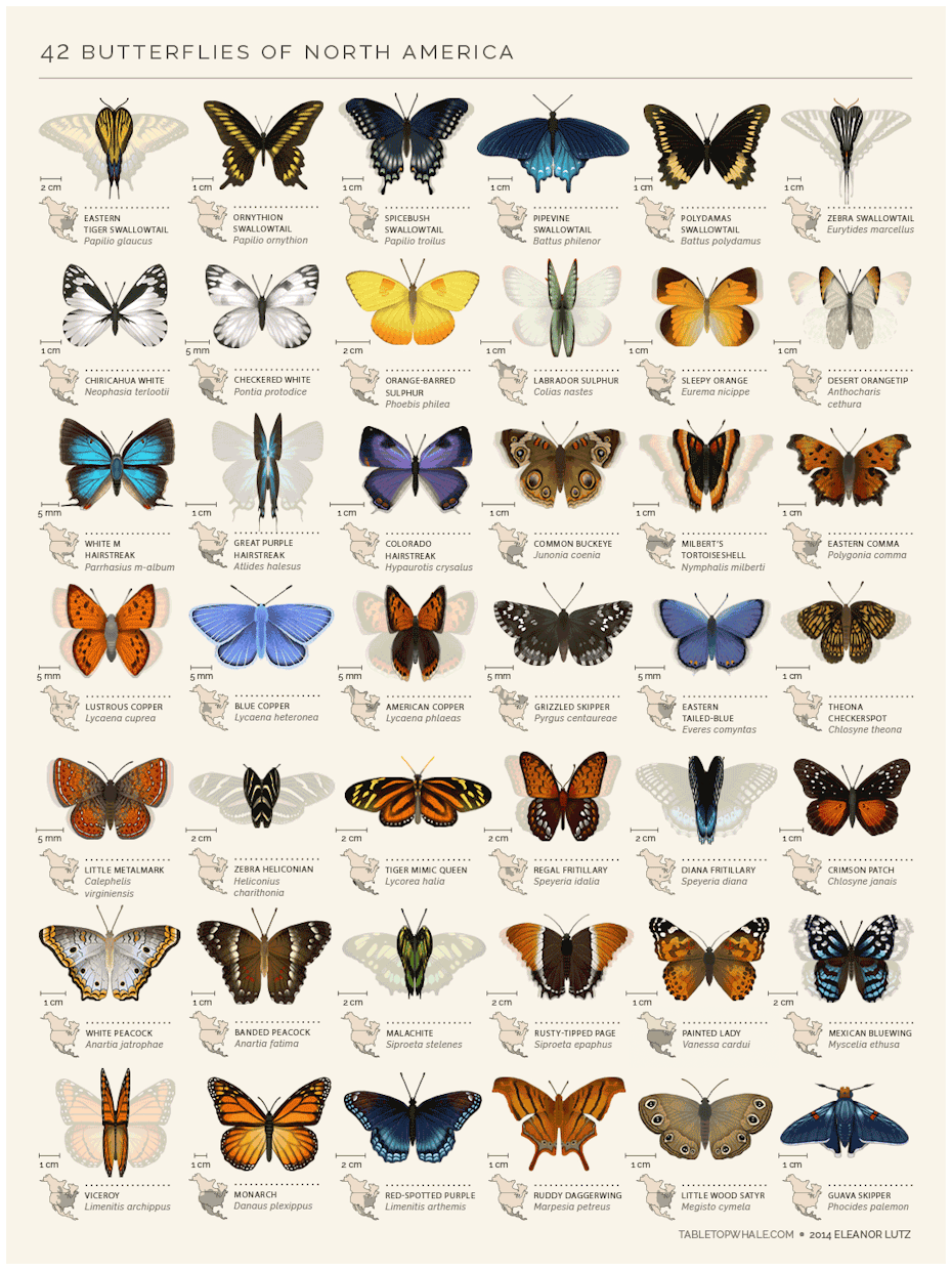
Example 3: 42 Butterflies of North America | Tabletop Whale
Similar to “How to Build a Human”, this infographic uses animation sparingly with just the wings of each butterfly flapping. Arranged in a grid, this is a “choose your own adventure” experience with all the information clearly laid out for you to read in whatever order you choose.
Example 4: How Speakers Make Sound | Jacob O’Neal
This infographic about how a speaker works explodes different technical elements of a speaker, showing what each is called and how they work.
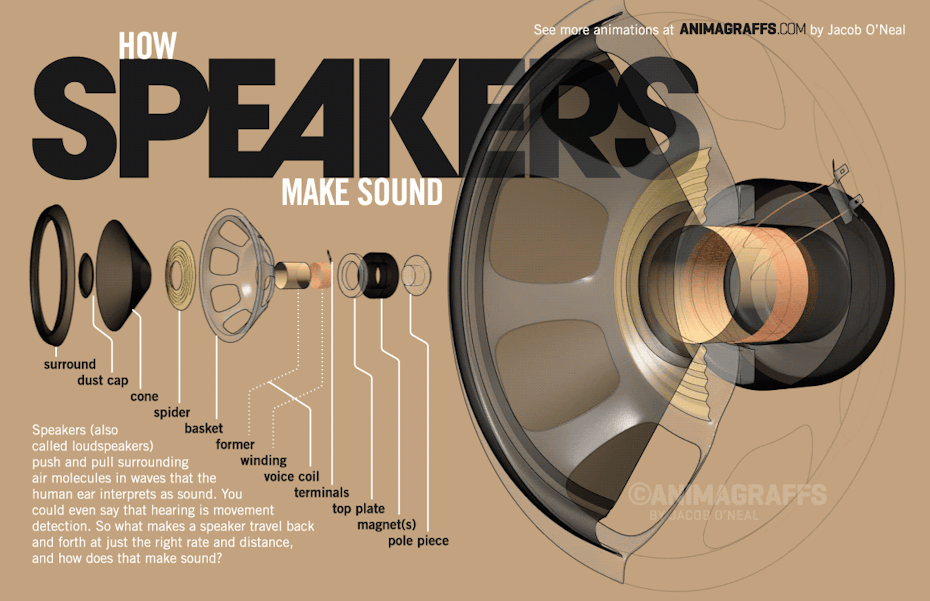
This is the strength of animated GIFs, using movement to capture the eye (the speaker explosion) to add context of how each element fits together and tell the story of how it all works (sounds).
Video animated infographics
—
From GIFs, infographics have evolved into fully-animated video infographics. The rise of the explainer video has been something to behold. And it makes a lot of sense when you consider how compelling it is to watch and listen to something being explained and visually presented to you.
Explainer videos successfully make complex topics easy to interpret by providing visual context. They solve the same problem that static and GIF infographics are attempting to, and offer even more control over the experience.
At any one time in a video infographic, the creator is fully in charge of what’s on screen and the pace at which it’s shown. For the viewer, it’s a more passive experience compared to static infographics (no scrolling necessary). But the visuals and audio can put things in context clearer for the audience, making complex ideas much simpler.
Here are some of the best examples of video infographics.
Example 1: Loneliness | Kurzgesagt
Kurzgesagt specializes in making big ideas accessible through engaging narration and sophisticated animation.
The channel uses visual metaphors to bring facts, figures and ideas to life—like the concept of loneliness, illustrated here as a character with a hole missing from their chest.
Example 2: Supreme | Patriot Act with Hasan Minhaj
Hasan Minhaj, the host of “Patriot Act” on Netflix, often jokes about his set being a PowerPoint presentation turned up to 11. But, as you can see in this video, he’s not really exaggerating.
Each episode covers a different topic, and the colors and imagery always adapt. But it’s essentially one long infographic, combining quotes, images, graphs and more. The animated graphics are basically the second host of the show in this case and are fundamental to successfully keeping the audience on the same page as Minhaj attempts to explain something quite complex within a half hour.
Example 3: How Toyota Changed The Way We Make Things | Bloomberg
Bloomberg’s “Then This Happened” series utilizes a really simple, but effective animated infographic style.
Centered around the idea of a scrapbook or drafting board, their style blends pictures, graphs, text and more as cut-out pieces of information compiled together on a table-top. The mostly black-and-white color scheme makes everything clear and accessible. But it’s the concept itself that makes it playful and compelling.
Example 4: Work, Simplified | Slack
This animation from Slack shows what you can do using mostly simple, recognizable icons—like email, messages and time—blending them with animations of people interacting in an animated space.
[embedded content]
This video uses no text on screen and no voiceover. Instead it shows what Slack can do for you with familiar, recognizable actions (like receiving a phone notification) to help the viewer contextualize what the app can do for them.
Example 5: Hybrid Cloud Flexibility | Microsoft
This video is the definition of what makes the animated infographic style so appealing to consumers. It takes a complicated concept, the cloud, and makes it easy to understand how it can help your business.
By supporting the script with context specific animations (what begins as a server turns into a building and that building ultimately plugs into a cloud and so on), it’s visually communicating what this service can do for you in a much more compelling way than just using stats or footage.
The power of visualizing data
—
As infographics have evolved, so has their audience. People are accustomed to having complex information explained to them in easily digestible visual forms today. And more and more, people will want to go at their own pace.
The next frontier of interactive infographics is already emerging and the “choose your own adventure” style is expected to grow. But what won’t change is the mission of infographics—to make the complex palatable. Whether it’s a static infographic, a GIF or a video, they all continue to make the complicated ideas of the world just that little more understandable.
Whether you want to learn more about video production or want to master video marketing, we’re here to help. Now’s the time to up your video and animation game.