45 animated logos that will inspire your brand to get moving
Animated logos are on the rise, and it’s no surprise. Our eyes gravitate towards things that move: ocean waves, blazing fires and computer screens. That same eye-catching magic has recently surfaced in logo design. Check out how these logos spin, bounce, fold, warp, transform and more.
Here are the best animated logos to inspire you:
1. Octopus
—
This animated logo by designer Sava Stoic will surprise you with a cheeky octopus that blinks, stretches and finally pops out of the confines of the letter O.

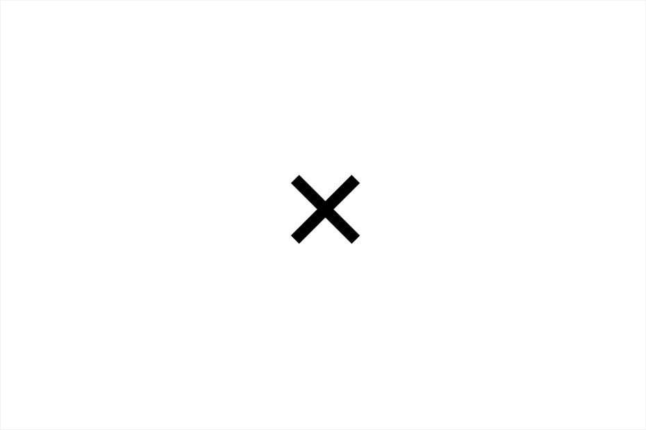
2. LUX
—
For investment company Lux Capital one thing is clear: make money. Design studio Mucho plays with the idea of addition, multiplication and profit by rotating the “X” in Lux. Additionally, after the “X” rotates, it rises upwards and to the right, another nod to the idea of profit.
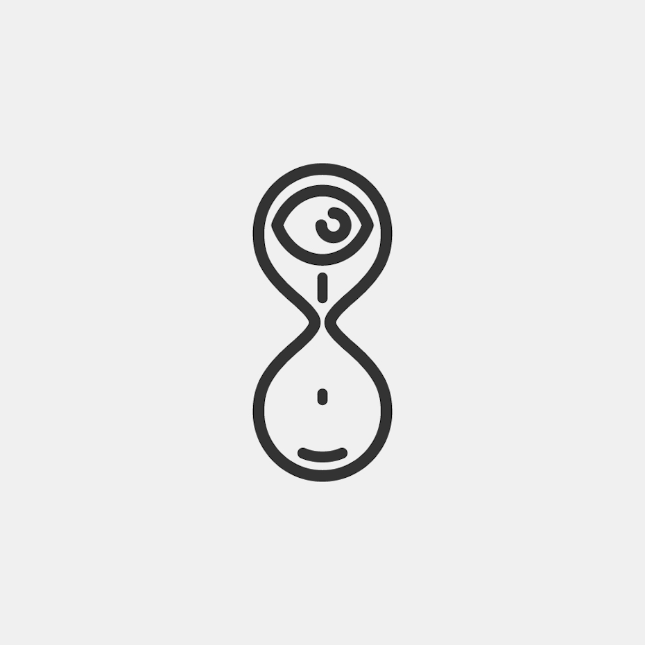
3. Eye in an hourglass
—
This genius logo by designer Minimalissio involves an eye that flows through an hourglass. Its modern line art design is minimalistic yet incredibly effective.
4. Giant Owl
—
The Giant Owl logo takes a different approach to rotation. The circular forms start by rotating like a film reel, then they blink like owl eyes. This is the practicality of animation; we wouldn’t necessarily understand what those shapes were without the movement. The animation opens up doors to logo design concepts that wouldn’t succeed with static art.
5. Captain Paris
—
This simple and classy animated logo for a French high-end cruise company merges a captain’s portrait into an Eiffeltower-inspired anchor.

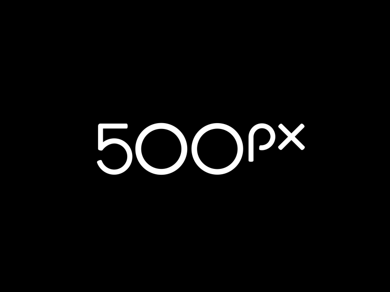
6. 500px
—
Photography network 500px rebranded with this bold and playful animated logo that “evokes a fingerprint with animation that echoes the turn of a camera lens.”
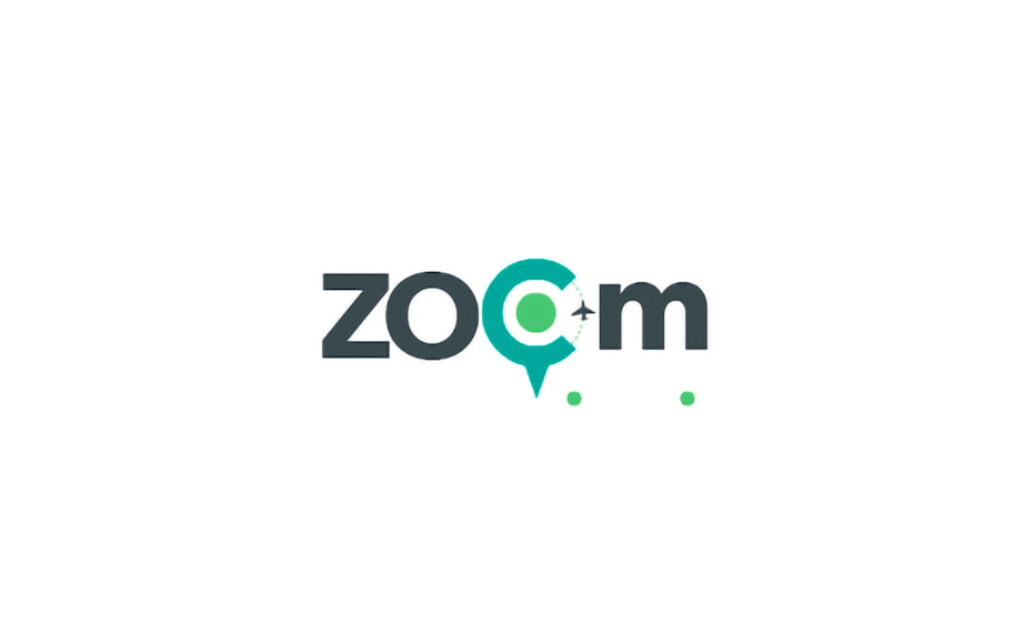
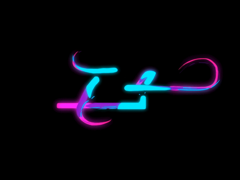
7. Zoom
—
This animated logo for Zoom uses rotation and map iconography to represent travel destinations around the world.
8. OpenView
—
Everyone loves a “big reveal.” It’s used in magic acts, narrative storytelling, game show prizes and even in logo design. Check out how Pentagram uses a reveal to expand on the concept of “opening” in their logo for OpenView. The logo begins with the “O” and “V” characters, then spreads them apart and reveals the full logo name in between. This use of a reveal allows the logo to transition seamlessly between its full form and its “shorthand” version.

9. 99designs
—
These sample animations of the 99designs logo reveal the logo mark through splashes of color and dynamic wipes that swirl and bounce.

10. The Doorman
—
This fun animated logo by designer Musique for The Doorman cleverly reveals a door in the gentleman’s tophat—it’s simple yet memorable.

11. Delfina Foundation
—
Delfina Foundation, an artists’ residence non-profit, is represented by a bold and modern monogram. The logo reduces down to an underline, then to nothing, and finally completes its cycle by revealing the “D” and “F” again. It has a utilitarian feel and quite simply it works. This straight-forward functionality represents the idea that Delfina Foundation is bringing functionality to artists.
12. Beyond Plastic
—
Beyond Plastic looks to the future with this incredibly well-crafted animated logo by designer sheva. With its emphatic animation of a hand grabbing a bottle in triumph this logo sends a powerful message.

13. Tutor Reactive
—
Tutor Reactive, an education app, needed an animated mascot for their logo. This cute robot with its simple eye blink animation does the trick!

14. Faymus
—
Hand-drawn logos—both skeuomorphic and real—have been around forever. It’s no surprise that designers have started using animation, like this one for Faymus, to take that style to the next level.

15. Bullhide Belts
—
For belt manufacturer Bullhide Belts designer Zarkum created a bold animated logo of a belt that twists and transforms into a bull’s head in brush stroke style, finishing with a puff of smoke as the bull snorts.

16. Tangles
—
The Tangles logo beautifully depicts all the elegant swirls and flair of hand-drawing a script logo.
17. Embla
—
Embla uses animation to visually articulate the process of painting the logo. The animation exaggerates the logos’ hand-drawn appearance by showing us the artistic process.
18. Feral Sphere
—
The Feral Sphere logo by Mind Design takes a different approach by using animation as a method for iteration. In other words, each frame of the animation portrays a new version of an organic, living logo. This concept works well for a fashion company that creates their products using organic materials sourced using renewable energy.
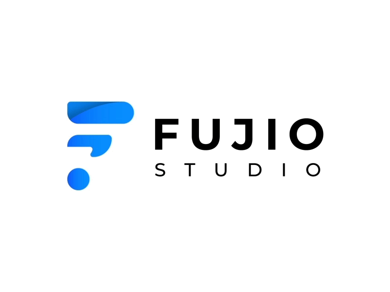
19. Fujio Studio
—
With this animated logo designer Adam Muflihun shows us what Fujio Studio does—through the process of constructing and drawing the logo itself.
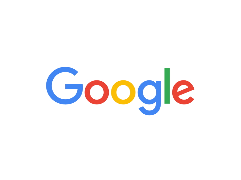
20. Google
—
Even Google relies on animation to transform the word “Google” into a microphone, a pulsating wavelength, bouncing dots and a shorthand “G” logo.
21. Brikk
—
Designer Gun Karlsson uses animation and vibrant colors to transform the word “Brikk” into a neon glowing brick.
22. Ideo Architekci
—
Dynamic branding has always been a challenge of figuring out how to make a logo fit within any dimension or scale. Animation is one tool that can facilitate that process. For example, the Ideo Architekci logo design contains a yellow grid based area that can expand or contract to fill any space. It’s a great solution, especially given that architecture often works with similar grid systems and floorplans.
23. Alphabetical
—
Who says animated logos are for grown-ups only? Their cartoon character makes them perfect for kid’s brands, too. Cartoon-like animated logos are great for fun brands that want to stand out and this logo for Alphabetical demonstrates how it’s done.

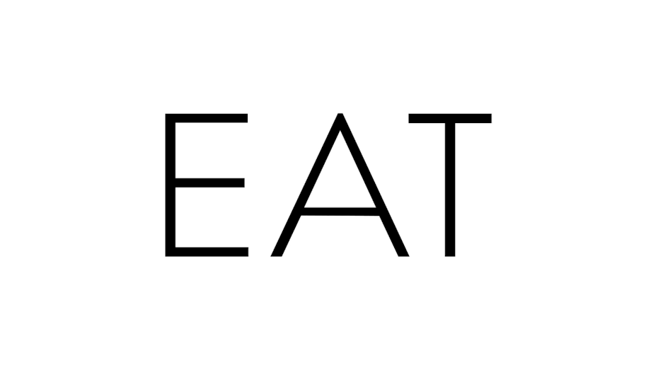
24. Eat
—
Animated expansion serves other concepts, too. The Eat logo by Fable literally eats as the typographic characters get bigger and bigger with each “bite.”
25. Simon Pengelly
—
The logo for furniture designer Simon Pengelly expands by adding lines or layers to represent the layering of plywood. Not only does this speak to the material in his products, it helps the logo fit into different spaces throughout the company’s branding.
26. Frameline
—
This animated logo for a queer film festival evokes the framing mechanisms of a film camera.
27. Kwickr
—
This logo by designer Milos Zdrale perfectly reflects the fast-paced identity of brand kwickr, using quickly appearing letters and a minimal and modern style.

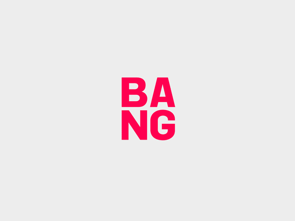
28. Bang PR
—
The trend of animated logos has also brought many designs that replace one aspect of the logo with a set of interchangeable parts. The Bang PR logo explodes the word “Bang” and fills the center with an interchanging set of PR related successes, such as “10 billion ‘likes’” and “HEROIC STUFF”.
29. Sello
—
Sello uses interchanging animation to replace the “o” in Sello with a set of circular objects that people sell on the platform.

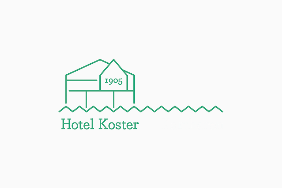
30. Hotel Koster
—
The Hotel Koster logo by Bedow swaps out simple illustrations of three parts of the hotel: the dining room, bar and terrace.
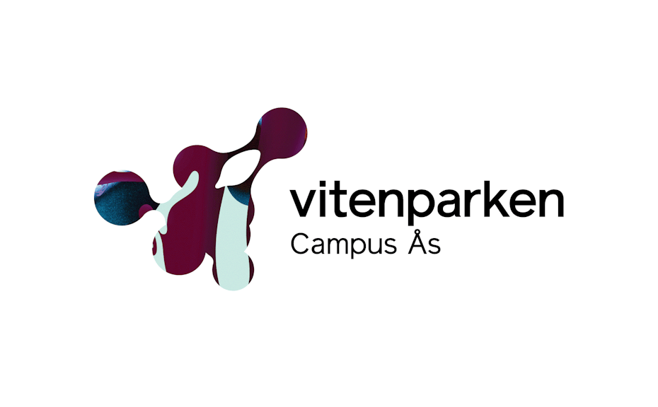
31. Vitenparken
—
When the traditional Norwegian Agriculture Museum set out to transform itself into a modern science center, they needed a fresh start. This new brand blends abstract, science-inspired art into a gorgeous animated logo.
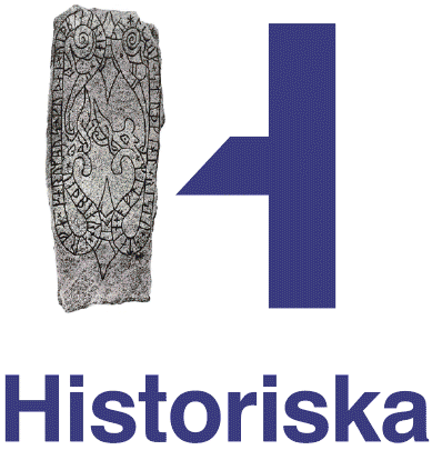
32. The Swedish History Museum
—
The rebrand of The Swedish History Museum blends the ancient and contemporary worlds. According to Bold: “The logo is a combination of a classic serif font and a modern sans-serif font. The serif part can be replaced with historical artifacts giving the museum an opportunity to be playful in their visual expressions and display the museum’s breadth of exhibitions and activities.”
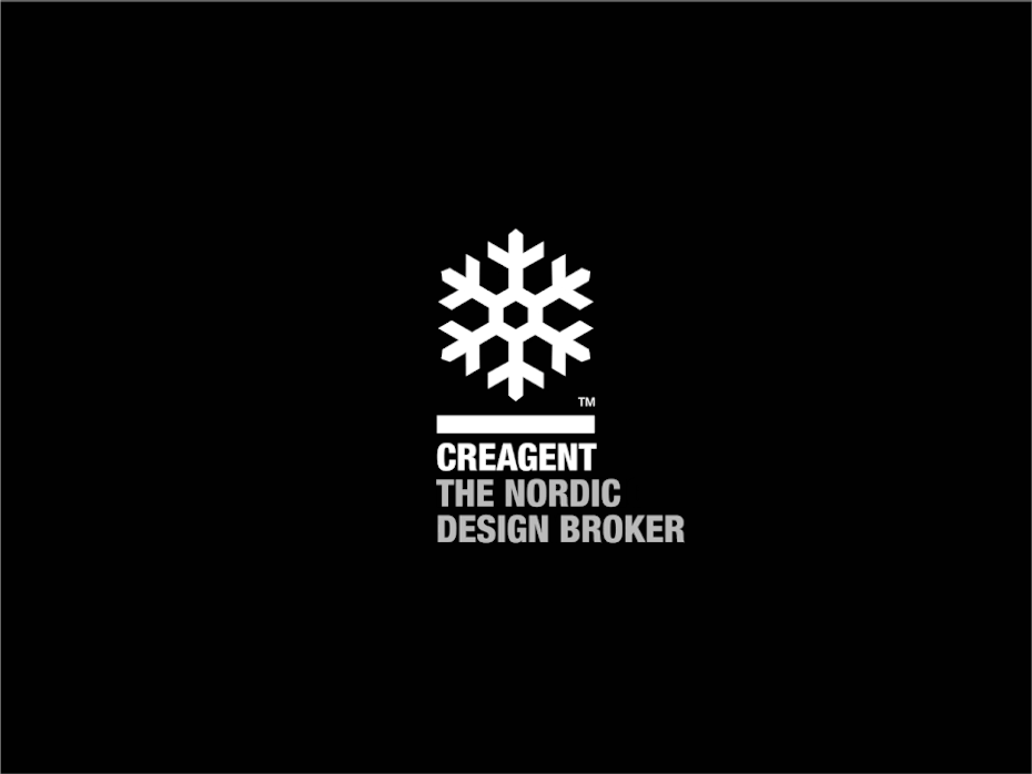
33. Creagent
—
Bond created a simple, yet stunning logo for Creagent that replaces their logo icon with examples of the services they provide.
34. Design Torget
—
Animated rearranging logos take existing logo elements and move them around into different compositions. Design Torget rearranges the letters “D” and “T” to represent different products they sell.
35. Sim Smith
—
The Sim Smith logo plays with the idea of a picture frame featuring rearranging content—a perfect idea for an art gallery!
36. Modhouse
—
Modhouse, a sustainable modular home company, represents their product with an animated logo built of modules. In the animation, we see each “module” of the logo come together and rearrange themselves in a central location on the grid.
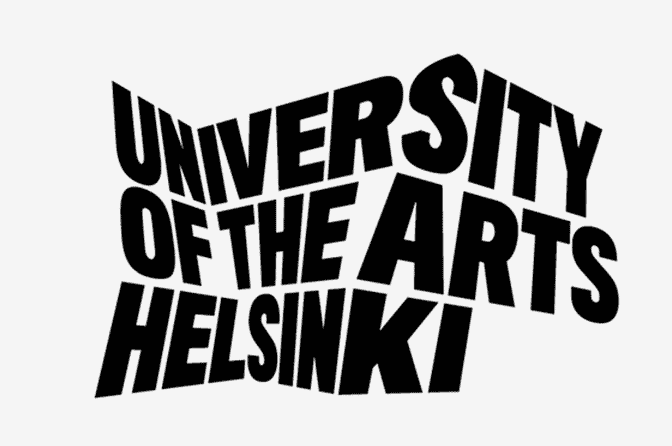
37. University of the Arts, Helsinki
—
Stretching and warping are like the fireworks of animated design. The University of the Arts Helsinki logo looks like a bouncing building full of creative artists who are about to bust the walls down.
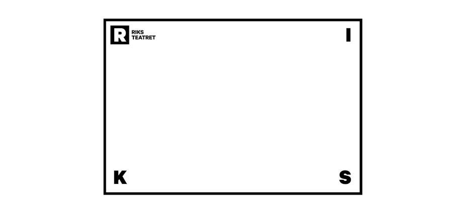
38. Riksteatret
—
Not all stretching and warping logos have to be explosive. The wonderfully modest logo for Rikstreatret, a touring theatre company, features a black border or “stage” that stretches and warps, speaking to the idea that they perform in many different spaces of different shapes and proportions.
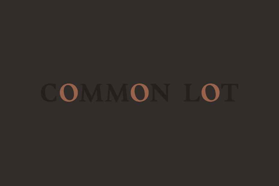
39. Common Lot
—
Restaurant Common Lot uses movement to give each “O” a life of its own. The restaurant is inspired by common land, grazing sheep and shared plates, and the “O”’s can be perceived as grazing animals or traveling people coming together at a dining table.
40. Lighthouse No. 6
—
Designer Brien Hopkins gives the shining beam of a lighthouse by allowing it to flash across the logo from left to right, and to complete the number “6” with its creation of negative space.

41. Impact a Hero
—
With its instantly recognizable red, white, and blue star iconography and a simple 3D flip, the animated logo for Impact A Hero evokes a patriotic medal.

42. Echo
—
Trüf Creative shows us a logo for Echo Capital Group that moves from left to right, a wonderful visual articulation of motion that feels like we are moving or traveling across each letter.
43. Haverstock
—
Haverstock logo by Spy uses a 3D fold to bring six striking vertical lines into the shape of an “H.”
44. Ridley
—
This Ridley logo reconstructs the company’s standard wordmark in a 3D space.
45. K3
—
This animated logo by designer Musique not only adds movement to the logo itself, but also integrates the brand’s slogan—two in one!
Get moving with animated logos!
—
Now that you’ve seen how designers like to move it, we hope you are feeling inspired to shake things up, too. Don’t be afraid to approach the idea of an animated logo in your next design endeavor. These 40 examples of animated logos can showcase your brand in a way you never thought possible.
Want an animated logo to get your brand moving?
Work directly with one of our talented designers to make it happen!
—
This article was originally published in 2017. It’s been updated with new information and examples.
Hey there! Here I’m presenting about myself! My name is Parth! A little bit Introvert, but crazy about technology. I’ve completed Masters in Structural Engineering. Recently, I left a 40k/Month job from Adani as Structural engineer. Before coming to YouTube, life goal was work in MNC along with established my own structural consultancy. I belonged to baniya family, business is in my blood. I have left my PhD Planning for now, I’m experimenting digital transformation with my family business. I believe that I can change Indian traditional business thinking with my creative ideas, Automation, and planning with innovation. Best DSLR camera Best DSLR camera DSLR camera DSLR nikon DSLR nikon DSLR canon DSLR canon DSLR olympus DSLR fujifilm You can visit my blog list mention below: Lets get start affiliate Youtube Best hosting eat the fat off painkiller weightloss anxiety website traffic amazon bicycle money management loss weight loss weight marketing marketing google monetization programs programs programs health insurance programs programs Microsoft Advertising Amazon Advertising Market Presso Work from home jobs Work from home jobs entry level remote jobs seo netgear router fast and cheap cheatsheet power point wordpress tutorial business transformation